We're now in a lovely smug position of having an organization integrated with Futrli Advisor and with a forecast that we can use to report on. Next step, let's build some reports and bring some data to life!
- - - - - -
Reports can be created in our 'Reports' feature, but for now, let's focus on creating a board. A board on Futrli Advisor is effectively a blank canvas, ready to have cards added visualizing your organization's information.
This is the longest help guide in our set of five, but we've kept it simple, so it shouldn't take you too long!
- - - - - -
You can find the 'Dashboards' section menu at the top of the window. Head into it and you may just find a pre-built template we have added to your account. We'll ignore this for now and build our own by hitting 'Controls', then 'New dashboard':

By clicking into the title, we can give the board a new name, unless you'd like to continue with the name 'New Board' of course. Let's go crazy and call this one 'My New Board'.
In this example, we're going to add three cards to the board:
- A 'Report Card' showing our monthly expenses for the current financial year, starting with actual data before forecasted data takes over for future periods
- A 'Comparison Card' that shows our profit and loss accounts for the last six months against the same six months from the previous year
- A 'Cashflow Forecast Card' that will show our forecasted cash flow for the next 12 months
These three examples will give us a good chance to see the different options you have with cards, building your own and using our pre-made templates. Don't worry, we're not going to go through every single step for all three (that would make for a long help guide!), let's go through the first card in detail and then bullet point the remaining two for you to build on your own.
First up, how have our expenses looked this financial year and how will they look moving forward? Let's build a 'Report' card!
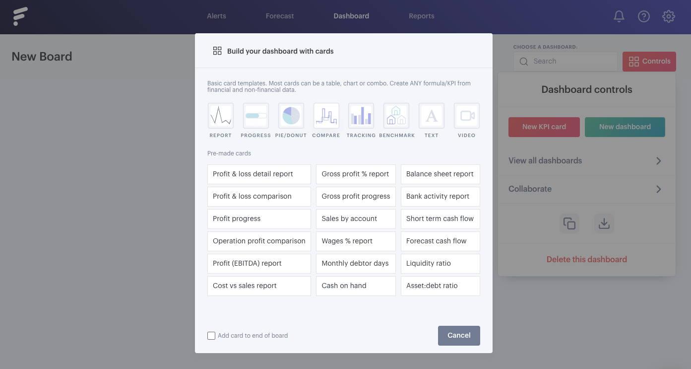
You'll see that any board you have on your account will have a 'Controls' option in the top right. Here you'll see your basic options, most of which we'll cover later on, but for now we'll need to click 'New KPI card'. This opens a window out with some options broken down into two sections:

The first are your basic card templates, these are for building your own cards. We're going to use the option on the left of the list, 'Report'.
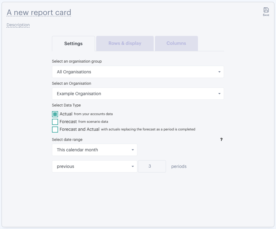
The card is added to your board and you'll immediately be able to start tweaking the settings to build the report you want to see. To start, let's take a look at the 'Settings' tab:

What we want to see in this report is both actual and forecasted data for our example organization for the financial year, but broken down into monthly periods. In this case, our example organization's year end is March, so we'll need to:
- Select the organization in question
- Select the option to show 'Forecast and Actual' data
- Select the scenario (forecast) that we'd like to reference
- Keep the default behavior that our actual data will appear until the last available period (the last completed month in this case)
- Set the date range to show the first month of the financial year, then the following 11 periods
Once those settings are in place, we can go about setting the correct date range. You can see that there are various options for date range, but with the first month of the financial year in this example being April, we'll use the 'Custom Period End' option to select April 2018 (make sure you select the last day of the month to include all data for the month), then the following 11 months, totalling all 12 months of the financial year. If the organization you are using to run through this has a different year end, you can adjust your card set up accordingly!
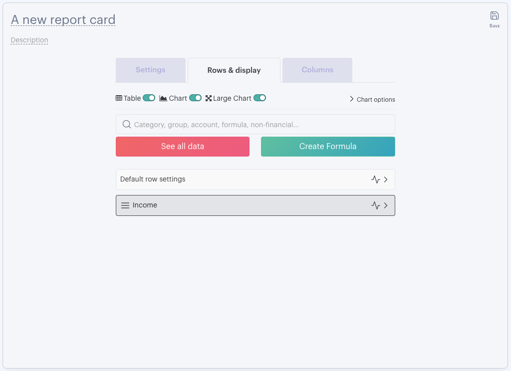
Once happy, we can move into the 'Rows & display' tab. The options you select here (and within the 'Columns' tab) will impact what appears within the report and how it displays:

For this example, let's just say we want to see a chart. By default, the card will be set up to show both a table and a large 'column' chart for Income, so we just need to deselect the table by using the toggle. We don't want to see Income in this report, we want expenses, so we'll need to add a row. You have two options to add rows to the report. You can use the search box and type 'expenses', or you can click the option 'see all', both are nice and easy to use.
Once you've added expenses, you'll see that an option to remove rows has now appeared in the shape of a cross:

Click that cross to remove the Income row and the report will now only show expenses.
By clicking the chart icon adjacent to the row that is set to display, you can change how that row displays on the chart. We don't want the default column chart for this report, we're going to go crazy and use a 'Spline Area'. Click that chart icon and select that display option.
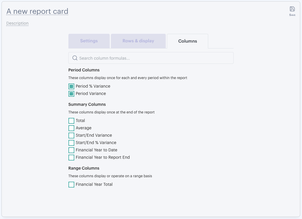
That's the report section sorted, now we can dictate any column formulas by heading into the 'Columns' tab:

The report card default is to have the 'Period % Variance' and the 'Period Variance' options selected, but we can remove these if we want. For our example, we've selected to show a chart only. Columns will actually only display on a table, so if they are removed or not is irrelevant here. We'll be using these columns in a later example!
Give the card a name, this one can be called '2018/2019 Financial Year - Expenses' and we're all done! In the top right corner of the card, hit 'Done' and admire your glorious report card!
Now you know how to build a card, let's run through how you can set up the other two!
Profit and Loss Comparison
- Hit 'Add Card'
- Head into the 'Operational KPIs (Profit & Loss)' section and select the option 'Profit & Loss - This Year vs Last Year' from within the 'Comparison' list
- Select the organization you'll be reporting on, then ensure that 'Year vs Year comparison' has been selected in the column 1 settings
- Set the date range as 'Last calendar month' and the 'previous' '5' periods
- Click into the 'Report' tab and un-toggle 'Large Chart'
- Head into the 'Columns' tab and deselect 'Column £$ variances'
- Hit 'Done'
We've now got a Comparison Card showing our organization's profit and loss accounts for the previous six months and how that compared to the same periods the year before. You can select which displays on the chart with the drop down in the top right of the card!
Cashflow Forecast
- Hit 'Add Card'
- In the 'Build Your Own' section, select 'Forecast Cash Flow'
- Select the organization you'll be reporting on, but this time we will select the data source is 'Forecast'. Select the forecast you'd like to reference
- Set the date settings as 'This calendar month' and the 'following' '11' months
- Into the 'Report' tab, click the chart icon adjacent to the option 'Default row settings' and select 'Spline'
- Finally, head into the 'Columns' tab and deselect both 'Period % Variance' and 'Period Variance'
- Hit 'Done'
This report now shows us our forecasted cash flow going into the next 12 months. If you'd like to make the card bigger, you can click and drag the card's border! You can also drag and drop cards into different positions.
- - - - - -
There are countless reporting and display options available when building cards and adding them to boards. The Printed Reports tool gives you even more option for layouts (more information in this help guide), but for now we'll move onto sharing what you've created. To do that, you'll need to make some Futrli Advisor friends!
