We know how important aesthetics are when presenting or interpreting insights for your business. With Futrli Advisor, you can tailor how your report looks to suit your specific needs.
- - - - - -
Setting default chart types
If you navigate to the 'Rows & display' tab on most cards (there are exceptions, like the 'Snapshot' or 'Video' card for example) you will see you have the option to customize how your chart is displayed by clicking the icon adjacent to 'Default row settings'.
The default is a bar graph, but there are multiple available options, which will update for all existing rows:
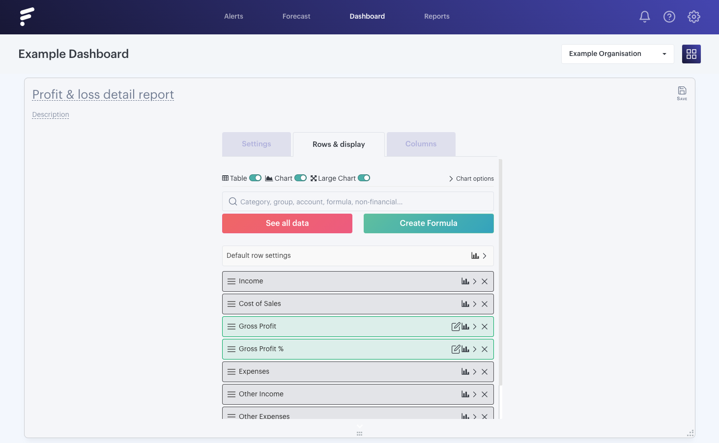
As you can see there are multiple available options for how you wish to display your information on your card, and simply selecting an option will change your default chart type:
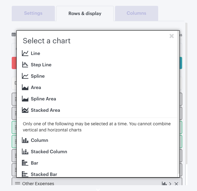
Selecting a chart using this method will update all rows on the card.
- - - - - -
Combining multiple chart types
For even more flexibility, you can also set how each individual row in your report displays on the chart. To do so, click the same icon, but adjacent to the row you wish to edit, then select a chart type for that row:
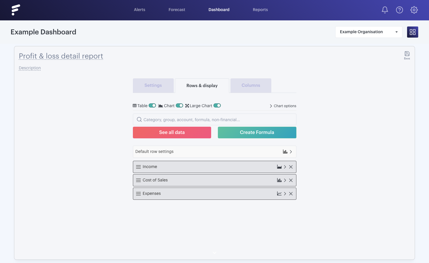
In this example, we'll use the 'Stacked Column' for our 'Expenses' and 'Cost of Sales', then display 'Income' as an 'Area':
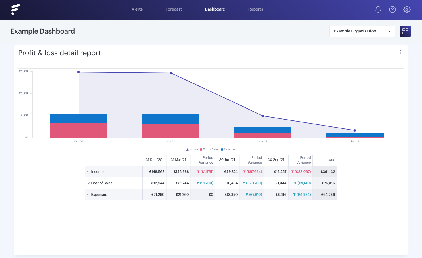
We can, of course, edit the order of the rows on the back of the card. We can do this by clicking on the three bars on the right of any row and dragging and dropping the row into the desired position.
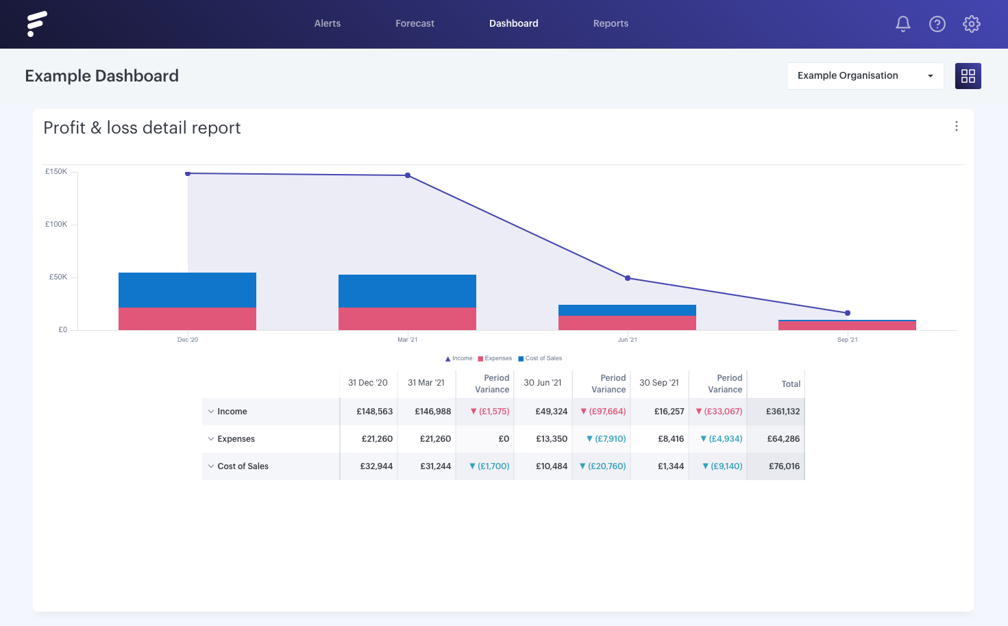
When we are happy, we can view our updated chart by clicking on 'Save' in the top right of the card, and when it flips around we can see the order of the rows has updated:
- - - - - -
Show and hide rows on a chart
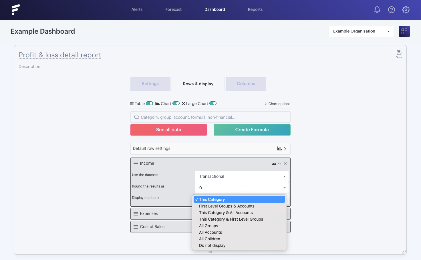
If you've added a non-financial parent, financial category or group to your report, then by default we'll display the parent, category or group total on your chart. However sometimes you'll want to display all account rows, and you won't want to add and configure each row individually.
With the display on chart option you can do exactly that:
- - - - - -
Show and hide actuals markers on charts
When you're working with actual and forecast data, you need to be clear on when your actual data ends and forecasted data starts. It's easy to spot this in tables as the cells are clearly highlighted, but when you're using charts it's not always clear.
Charts automatically display an actuals marker if you're mixing data, but if you don't want it visible it's easy to turn off too.
Let's take a quick look first to see how it appears:
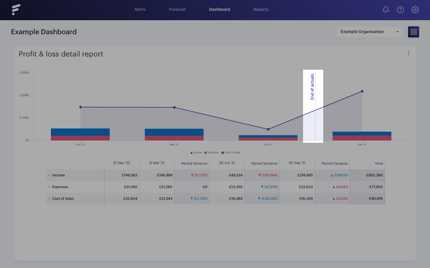
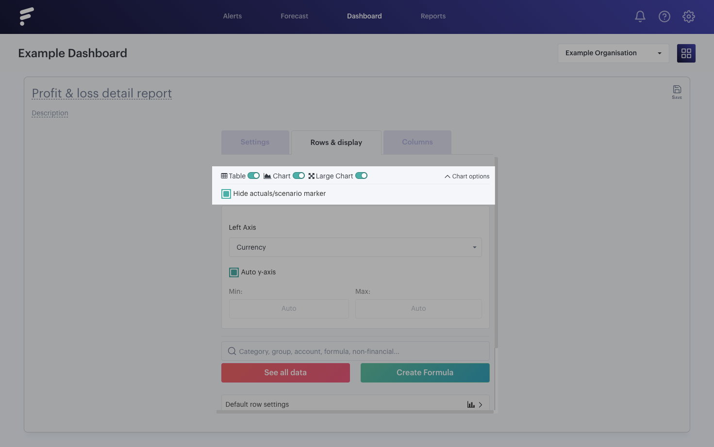
When we're using 'Forecast' only data, this shows us where our forecast begins and when we're using a mixture of forecasted and actual data it shows us when our actual data ends. If you don't want to display the line, then flip the card over and select click into 'Chart options'. This will then reveal the 'Hide actuals/scenario marker' checkbox, which will allow you to remove the relevant line from your report:
