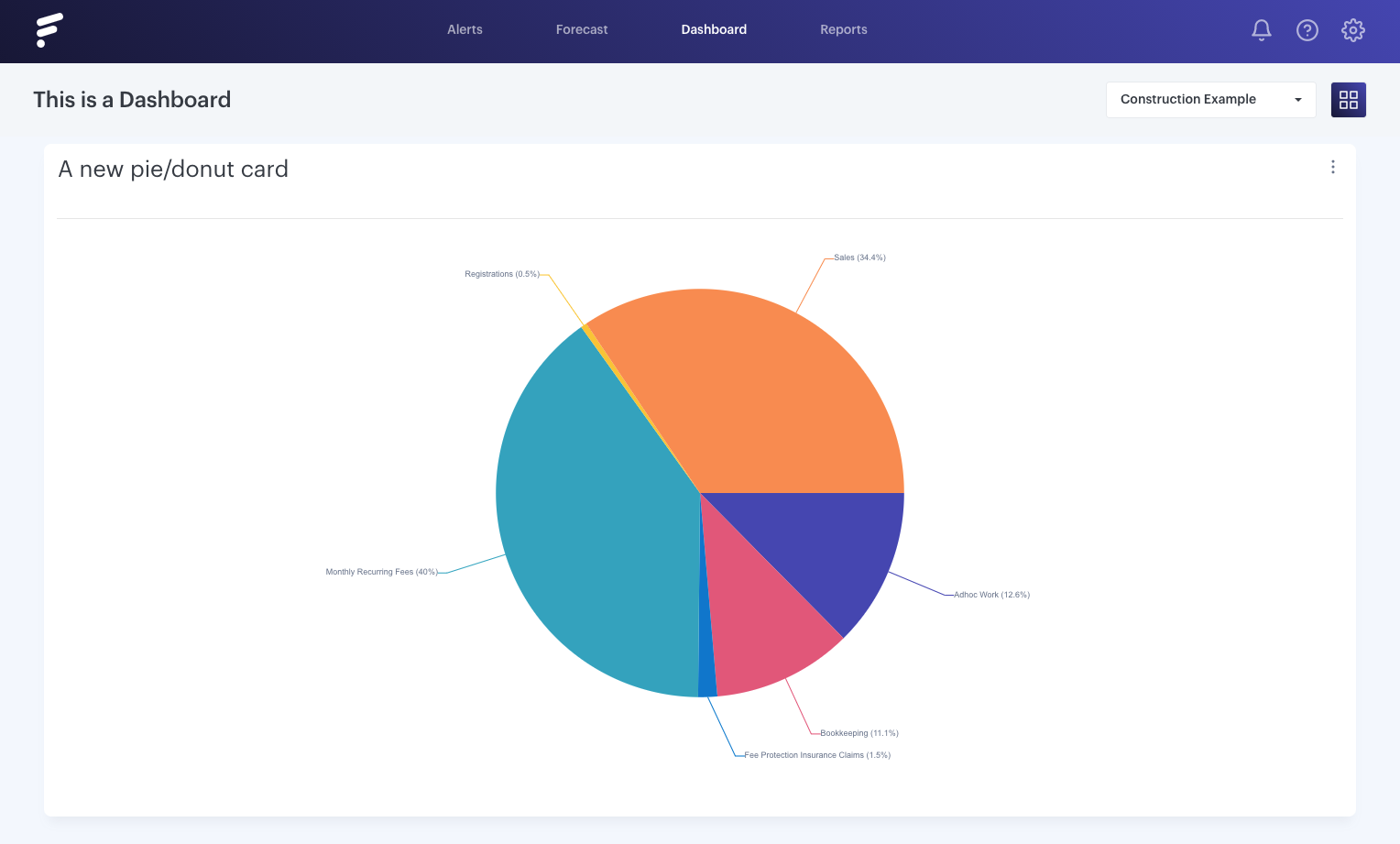
Formally known as Proportion cards, these are the perfect way to show your results against one another with the old school pie chart.
- - - - - -
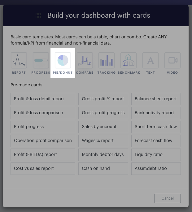
Top add a Pie/Donut card, you simply click 'New KPI Card' in your dashboard controls, and select 'Pie/Donut':

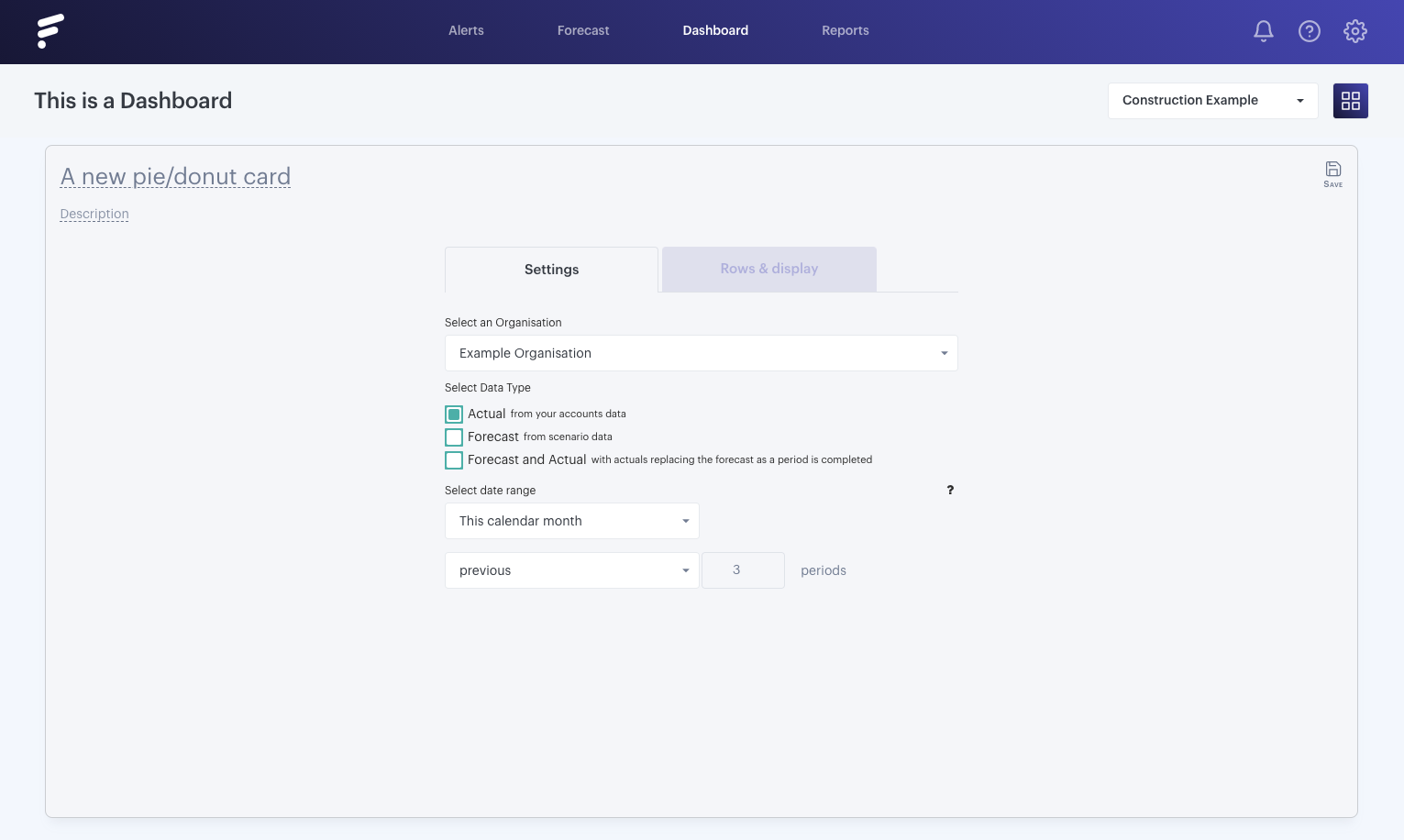
You can edit the data set in the Settings tab, much the same as you can for a Report Card:

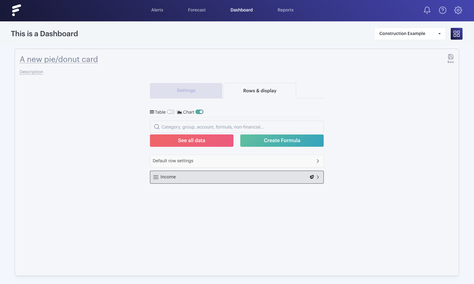
In the 'Report' tab, you can also add rows. This will allow you to customize what accounts you view in the chart:
- - - - - -
Where to use Pie/Donut cards?
The most effective time to use pie/donut charts is to answer the following questions:
- Which survey results were the most popular? (using imported non-financial data)
- Where are you investing the most money?
- What revenue stream is the most successful?
Something to consider is limiting your pie/doughnut wedges to six. If you have more than six proportions to communicate, consider a bar chart. It becomes too hard to meaningfully interpret the pie pieces when the number of wedges gets too high:

Pie/Donut charts can be very effective when used correctly, but incorrect usage will only yield ineffective results, while a bar chart may prove a more logical solution.

